Crewelwork Sampler
I've had the most relaxing week embroidering the sampler I started on the Tracy A Franklin workshop in Ali Halley's studio. Working with the beautiful colors I chose on the different stitch combination was just the tonic for the colder, wetter weather. I felt like I was right back in the Borders, surrounded by sun and the stunning colors of autumn!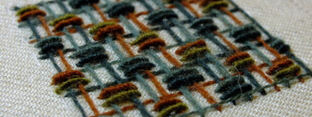 I'd forgotten how much I love embroidering on a sampler. Over the past 12 months I've been so focused on finishing my RSN Certificate Course and the stunning Loveday Crewelwork piece, I have really done anything else. I certainly haven't been playing with thread.Samplers are a chance to focus simply on your technique; to practice stitches you want to improve and to try stitches you've not tried. They also give you a chance to play around with stitch and colour combination.
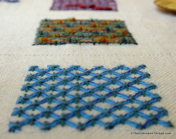
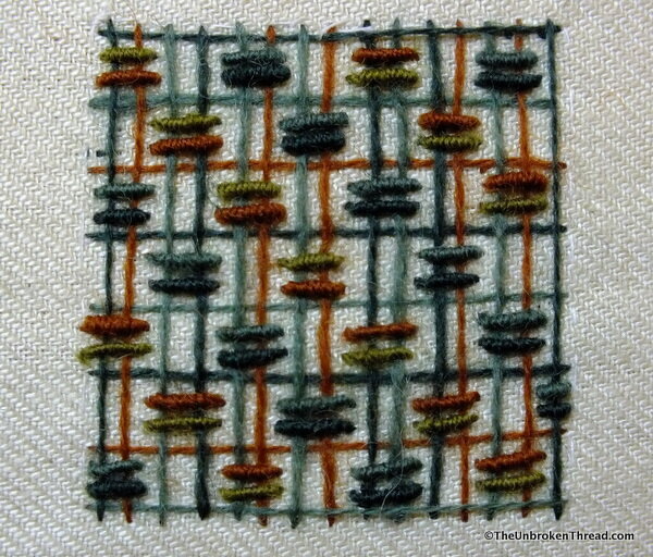 At the course in Ali Halley's Studio, Tracy had already put together sets of 4 colours from which we could choose 3 different sets. In the sampler, there are 3 rows of 3 squares, so one set of 4 colours is used in row 1, one set in row 2 and one set in row 3.Choosing the different sets started a conversation amongst us about colour. Tracy and Ali both shared their insights and Ali recommended a book my son in law had also recommended years ago: Color: A workshop for artists and designers by David Horning.As we worked on our different squares of combined stitches, it quickly became obvious how much one colour affects another. In the sample below you can see the impact the soft and dark green cross stitches on the bright blue laid stitches.
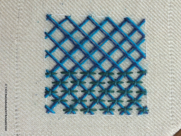 When I began this square the laid stitches looked too bright - even garish. However, I stuck with my choice to see how the colour would change (really, how my perception of the colour would change) when the greens were added. The greens really soften the vibrancy of the blues, making them far less strident.
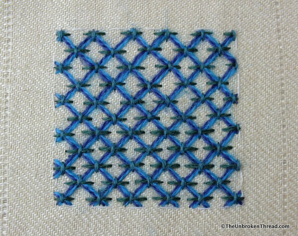 Now that the square is finished. the blues are bold, not garish, and the whole sample is bright and cheerful, not blinding!
 So many things affect our perception of colour: lighting, texture, other colours, the angle at which we look at something and, most importantly, how our own brain interpreters the input of colour. Have you ever had that discussion with a friend or a spouse about the "correct" colour of one thing to go with another? Years ago I was convinced that our living room carpet was gold and my husband was equally convinced it was green. When it came time to purchase a new sofa, those two different perceptions became problematic!
 In addition to the difference we have in perceiving colour, we all have colour preferences. I find myself drawn to the same colours over and over and rarely am I comfortable breaking out of my "set" of colours. I also have colours I think "go together" and colours that don't. Where or why these pairing were formed I don't know, but they are there and can be a very powerful influence when I'm choosing colours for anything.
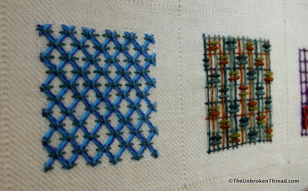 As I work through these different sample squares - all drawn from Tracy's book, Crewel Work, by the way - I'll be writing about the colours as well as the stitches. This time was more about colour but I promise I will write about the stitches next time. If you want to know more about the samples, I highly recommend Tracy's book - all the samples are in the book, as are all the stitch instructions so you could - if you've a bit clever - work out how to do the very same sampler I'm doing!
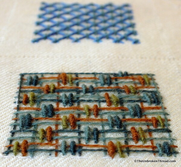 I'll leave you with a photo that brings to the forefront my favourite colour combination of greens and russet browns, with the bright blue in the background. I've ordered the paints needed to do the colour workshop assignments in the book by David Horning and I'll be sharing some of those with you. I'll also be trying to translate those colour experiments from the book into thread, not only paint, to see what effect the texture of the thread has on colour. This should be fun!