RSN Crewelwork Course Day 1 - design
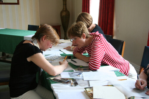
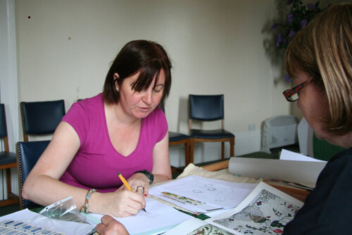
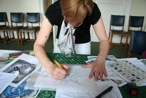
At the end of the first day my head was full to overflowing! So much new information, new skills, new ideas...I needed to sit someplace and just absorb everything. It was w-o-n-d-e-r-f-u-l!Since the days are so packed, I'll be writing about each topic separately rather than telling you about each day. The articles would be too long and maybe not as clear as I'd like. Today will be all about design and the process of design, including things I learned specifically to help us all gain confidence when creating our own design. Next time I will share everything about using a slate frame and framing up.We started the week with two tutors: Nicola Jarvis and Sarah Homfray. Nicola is a fine artist in addition to being an embroiderer. If you're interested in seeing any of her work, take time to look at her web site.: her work is amazing. Sarah Homfray has just had published the RSN Essential Guide to Silk Shading and her web site is full of information, how to videos, designs and loads more. We were in good hands. Both of our teachers have extensive design experience and their ability to guide us in our own design process was excellent. After going through the general goals of the course, we delved into the history of Jacobean crewelwork. All Jacobean is crewelwork but not all crewel work is Jacobean. Jacobean refers to the time of King James I (1603 - 1625). The style of crewelwork we are studying is Jacobean. It's very traditional but we certainly aren't limited to a traditional color palette or to traditional stitches. One of the characteristics of Jacobean design is that it's not a representation of the real world. The elements of the design are often out of proportion to one another. The leaves on a tree might be larger than the deer under the tree, a bumblebee might be the same size as a flower. Jacobean designs depict fantastic landscapes.
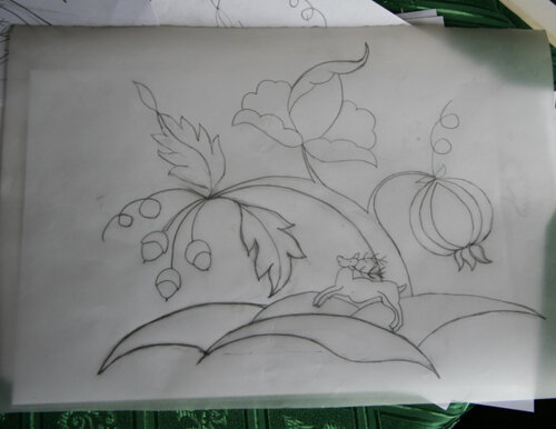
 We had a lot of freedom in designing our own piece. I took my very first design done a couple of months ago and showed it to Nicola and she was happy with the general elements and shape. However, we both felt that the tree looked like it was about to be blown over in the wind, landing on the deer and crushing him! She re-drew the trunk of the tree and showed me how to attach the three design elements to the new trunk and...voila!...the design looked 100% better.
 We learned about balancing design - that often a triangle shape works best when laying out the whole design. What one wants to avoid is everything lining up evenly on the lines of a square. When adding elements such as curlicues or squiggles, consider the direction - do they lead the eye inwards or outwards? Inwards tends to be more effective as the eye then travel into the center of the design, not off the edge. When grouping design elements, three or five is the magic number. Our eye will find that more pleasing. Think about balance in term of the size of elements and the number of elements in the design. Often one large element will be balanced perfectly by two smaller elements.One tip that helped me enormously was not to include perfectly straight lines at the bottom, sides, or top of the design. I had included hillocks at the bottom of my design and and intended to have a straight line at the bottom of the hillocks. Sarah explained that if the lines wasn't perfectly straight with the grain, the edge of the fabric and the bottom of the design (so three different ways to be straight!) it would look less than lovely. I modified the bottom of the hillocks and I feel far more confident that the final outcome will be good.
 Nicola encouraged each of us to develop our own design, have confidence in our own eye and let our individuality shine through in our design. Repeatedly we were told that it will take time, practice and patience to become better and more confident in our design skill but that the effort would be worth it. I couldn't agree more!Here are some tips that both Sarah and Nicola shared with us throughout the morning:1. Drawing improves your embroidery. You will see and understand the design more deeply and from different perspectives.2. Th spaces between the elements of the design are just as important at the elements themselves. It's called negative space. Pay attention to it.3. When working on your design, look at it from a distance. Turn it 45 degrees first in one direction - look. Then 45 degrees in the other direction - look. Then turn it upside down - look. Your eye will loose the 'picture' and see the design as elements. You'll see far more clearly the positive and negative space, the balance, the overall shape.4. When designing, steer away from all elements of the design lining up along the edges of a rectangle or square shape. A triangle shape is more pleasing and has more direction and movement.5. If you do decide to include a straight line across, for example, the bottom of your work, remember straight must be straight. It's difficult to keep the line straight with the grain of the fabric, edge of the fabric and the bottom of the design.6. Groups of three or five not two or four look best - unless you're designing something that is symmetrical!7. Try it! Don't be afraid! Stitching your own design is so rewarding! You will improve with practice!