
Italian shading - my take
During the “Humbly Magnificent Couching Stitch” course with Natalie Dupuis, we did a module on what is called Italian Shading. The name was given to this technique by Beryl Dean. to distinguish it from Or Nué. Italian shading can be defined as “Couching down threads (usually metal) with a variety of colored threads in lines that are not straight.”
As inspiration, I looked at a painting by Claude Monet entitled San Giorgio Maggiore at Dusk, 1908. I was drawn to the deep, rich, glowing colors of the sun reflecting in the water.

I wanted to reference the gentle waves of the water so I decided to work a round shape with gently curving lines to guide the laid gold threads. I downloaded an image of the painting and cropped it so only a small, round section was left on the page. Using tools in my word processing program, I drew repeated curved lines over the cropped image. The next step was to transfer the shape and a few of the guiding lines to the fabric. Lastly, I used colored pencils to reproduce the colors as best I could directly on the fabric.

Gold #4 passing thread was used along with DMC stranded cotton. I would have preferred to use Pipers Silks but didn’t have the full range of colors yet. I began couching on the center line I’d drawn in the circle and worked upwards from there.
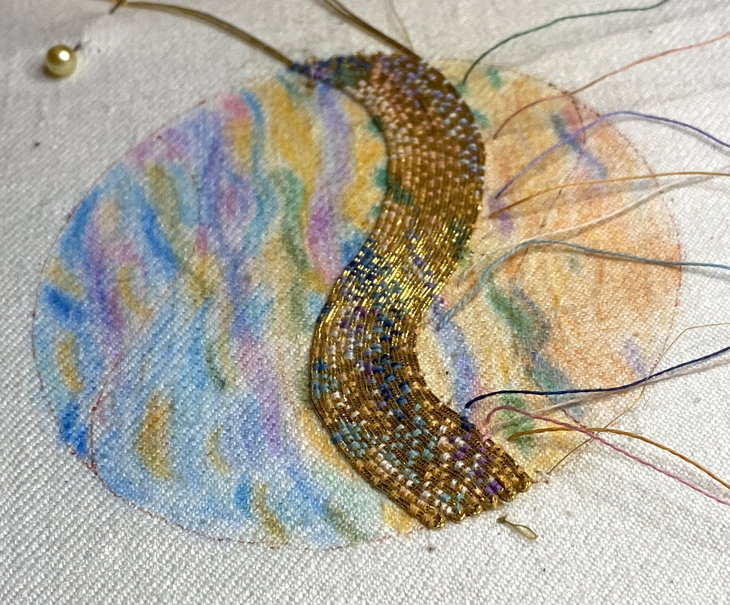
When I reached the top of the circle, I began again in the middle and worked downward. It’s important in this kind of couching to vary the distance between stitches. There isn’t a hard and fast rule as to how much space to leave between each couching stitch; it’s more about what you prefer. I decided I wanted the gold threads showing through at the top of the circle, where the sun would be glowing, so I left quite a bit of space between the threads.

You can see that I had a LOT of needles on the go! At this point (photo above) I had 15 different colors of thread. It varied depending on the colors Monet used in that section of the painting.
The entire process was one of the most absorbing things I’ve ever worked on. I would get lost in my stitching for hours at a time, looking carefully at the colors and how they blended together.

In the future, I plan to do more pieces like this. It’s a great way to really look at a painting and the way an artist uses color. The only decision I have left is how best to display it. I haven’t taken it off the slate frame yet because I want to mount it right away and I just haven’t had that big a block of time recently.
If you have any ideas about how to display/frame it, please leave a comment!